Creating a Responsive WordPress Site: A Practical Guide for Beginners
Learn how to create a fully responsive WordPress site, optimized for all devices, with our practical guide.
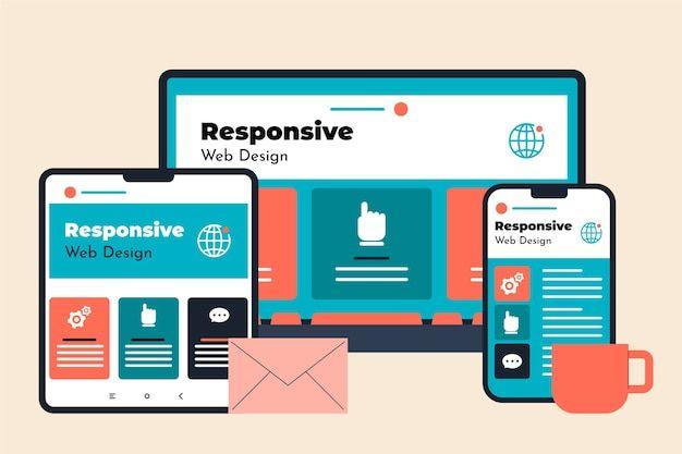
Introduction
In today's digital world, having a responsive website is essential to reach a wider audience. A responsive site automatically adapts to different screen sizes, providing an optimal user experience across all devices. In this article, we will explore step-by-step how to create a responsive WordPress site.
Choosing a Responsive Theme
The first step in creating a responsive WordPress site is selecting a theme that supports responsiveness. Here are some tips for making the right choice:
- Check mobile compatibility: Ensure the theme is well-suited for mobile devices.
- Read user reviews: Other users' experiences can guide your decision.
- Test the theme demo: Use your browser's developer tools to test the theme demo on various devices.
Using Responsiveness Plugins
Plugins are powerful tools to enhance your site's responsiveness. Here are some popular plugins:
- WPtouch: This plugin creates a mobile version of your site.
- Jetpack: It offers a mobile theme option to make your site more responsive.
- Responsive Menu: This plugin enhances navigation on smaller screens.
Image Optimization
Images can slow down a site, especially on mobile. Here's how to optimize their performance:
- Use modern image formats such as WebP.
- Compress your images to reduce their size without losing quality.
- Implement lazy loading to improve loading speed.
Conclusion
Creating a responsive WordPress site is crucial to providing a smooth user experience across all devices. By choosing a suitable theme, using the right plugins, and optimizing your images, you can build a site that not only attracts visitors but also keeps them coming back.

Ready to transform your operations?
Contact a local agency that understands industrial challenges and can create the perfect digital solution for your business.
